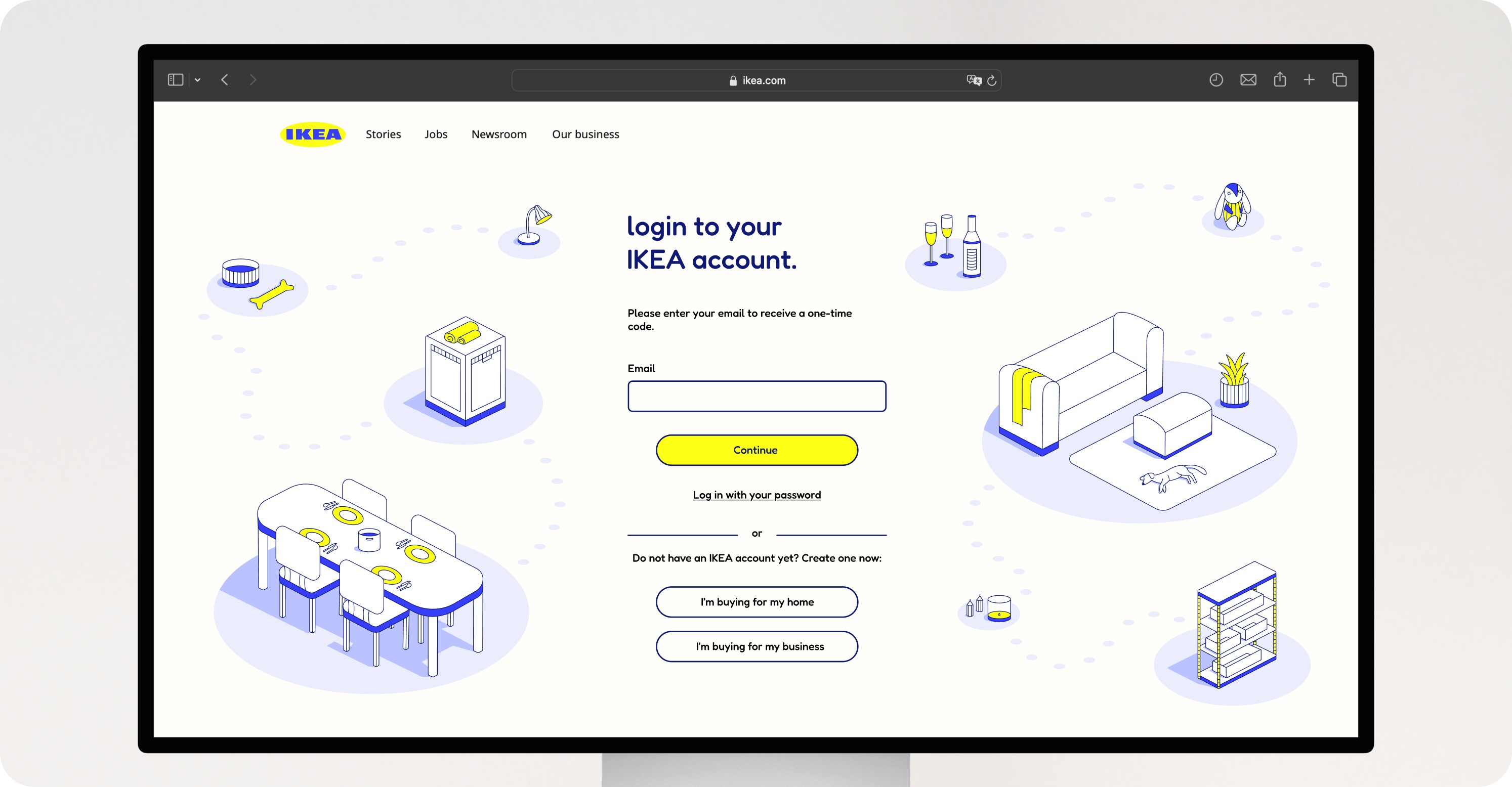
Illustration concept shown on a desktop screen

Illustration

A personal concept project exploring a new illustration language for IKEA and adapting it into a responsive web and mobile experience.

Illustration · Visual Design · Web & Mobile · Personal Project

Concept

The project began by exploring IKEA’s existing visual language, from its photography and website to the way products are presented in its stores. I noticed a recurring isometric perspective: furniture is photographed from similar angles, while the showrooms create small, carefully designed room environments.

The concept was to take this existing visual principle and translate it into a new illustration language designed for digital use.
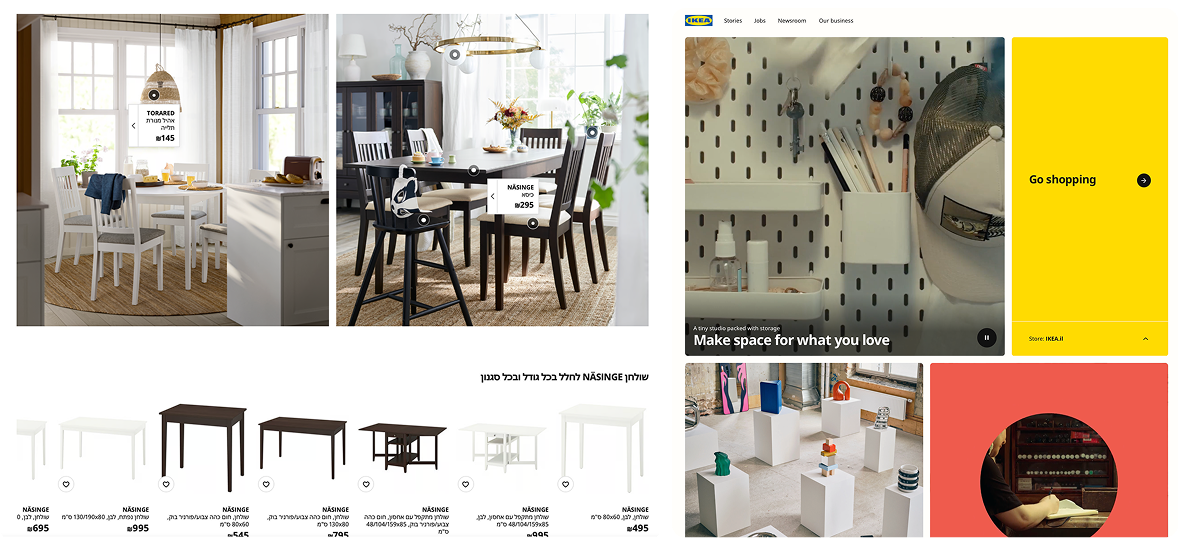
IKEA reference research: product photography, showroom compositions and website layouts

From Illustration to Interface

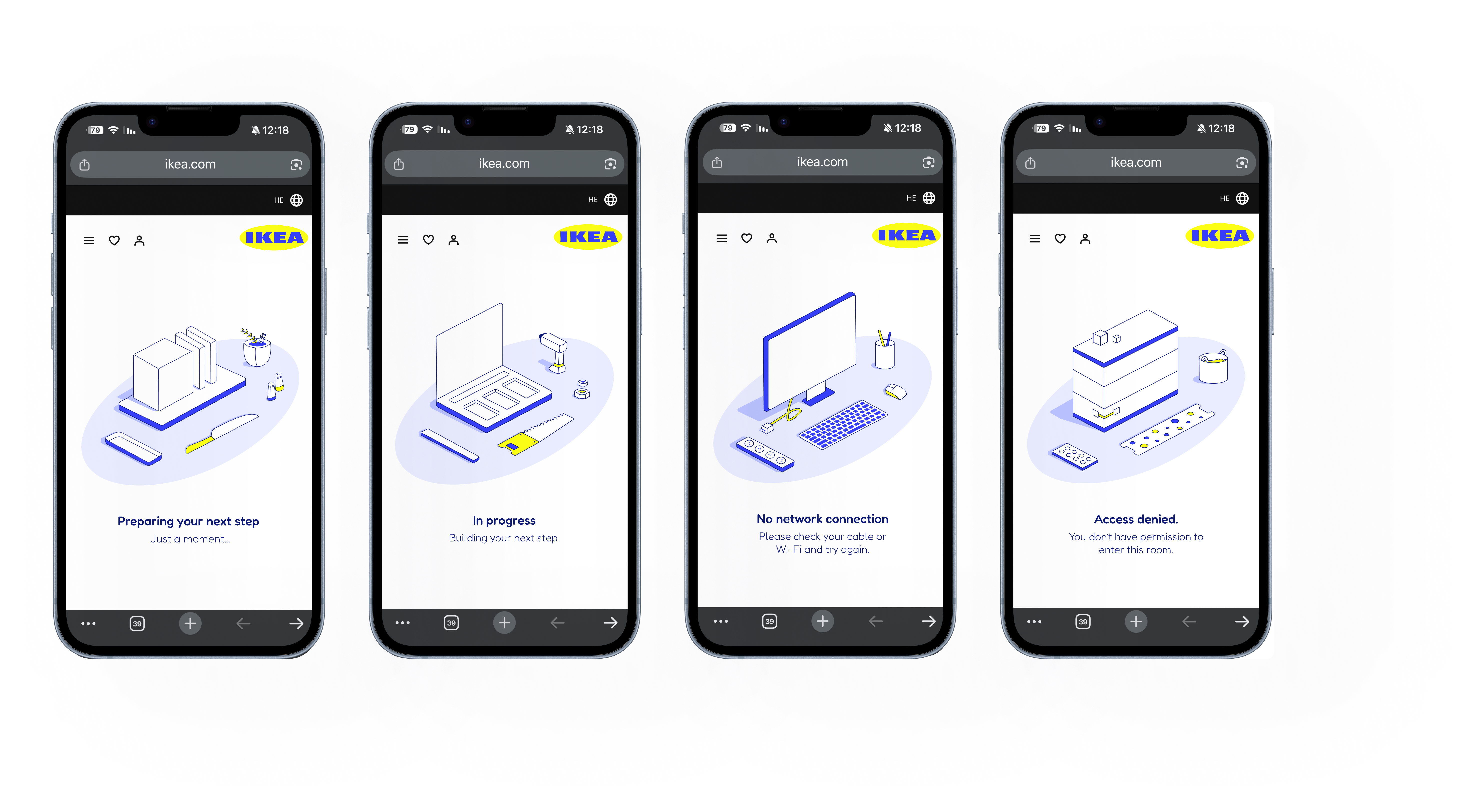
The visual language was translated into a login screen and four different empty states, each designed around a different context within the IKEA experience.

Rather than treating empty states as blank or purely functional screens, I used them as an opportunity to introduce personality and guide the user through illustration. Each state features a different environment while maintaining the same visual system, creating a consistent experience across web and mobile.

Bringing in Color

The illustrations use IKEA’s iconic blue and yellow color palette, creating a clear connection to the brand while maintaining a playful and cohesive visual language.

Four IKEA empty-state screens shown on mobile devices, using the blue and yellow palette

Designed to Discover

Every product featured in the illustrations was sourced from IKEA’s existing catalog. I explored turning these illustrated spaces into interactive shopping moments, where users could click on products they like and be taken directly to their product page.

This transforms waiting and empty states into opportunities for product discovery, without interrupting the experience.

Illustration concept shown on a large display

There’s More to See: